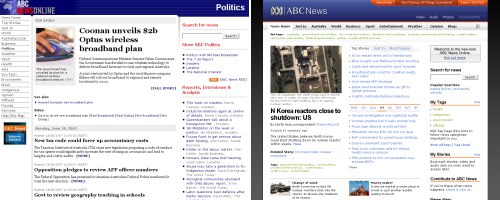
Aunty’s news service moves into the modern era

The ABC News site has traditionally done things well before our “yes we’re with the times honestly we are!” commercial news services, but they’d been slipping a bit lately with their clunky six-year-old design. As of today, they have a new design with more efficient use of whitespace, better searching, and fun AJAXy features. Oh, and it validates now, too.
But just like The Guardian, which dropped its mid-90s look last month to vocal consternation among the supposedly more loyal members of its audience, this move has wrought a rash of negative comments on the site. A few criticisms are sensible — it is annoying to not have lists of headlines from each news category on the front page, and I was fond of the old Politics category. But some are just silly: “I have to learn a new interface all over again, and I hate that … I might as well use MSN now”.
(From a user-experience point of view, this is not surprising: learning new things has a high cognitive cost and it’s a rule in interaction design that users want this minimised. But from a stop-and-think perspective, you’d seriously stop reading the ABC in preference to the unbiased quality of nineMSN?)
Not only does the new design bring ABC News up-to-date with current best practice, it leapfrogs the commercial sites with new techniques. One small example is that they’re integrating Google Maps with some stories, which isn’t much use in a story about Melbourne but is great for events from small country towns.


I always have a whinge about having to learn my way around a new-look website. Sometimes they get it right and make it easier to find what you want, but those are rare. The new look for the ABC site is much more attractive, but I’ve still got to get used to finding my way around it.
Of course, I always complain when Gam wants to rearrange the furniture or the cupboard contents at home too, even though it’s usually better than the old arrangement!
Sorry mate, but the new site – while prettier – is far more cluttered and contains more noise than signal compared to the old version. With the old one I could scan a range of topics at a glance to obtain my morning news, now it’s easy to miss something unless I tiresomely click each tab. As far as layout is concerned the entire right hand column is a waste of space. I don’t changes but they should always be an improvement rather than change for change sake. Fortunately the abc have heard the voices of dissent and plan to change the site to accomodate them. To be honest it wouldn’t be that hard to fix the front page layout but I expect it will take the abc a month and one-hundred thousand dollars to do it.
skribe, speaking of signal versus noise, I had a love-hate relationship with the front page listing that you’re pining for. It used to show three stories from every category, which was far too much for Weather but woefully inadequate for World.
I do agree with you that they should put that list of headlines back, and with Sarah that they need to make things more discoverable, but I think these are minor quibbles compared to the overall improvement — for exactly the reason you cite. Since it takes them so much time, money, and bureaucracy to do anything, I think any major step forward should be commended.