Who chose that typeface?
No, I haven’t neglected to pay the ISP bill; rather, I’ve been caught up in a string of events that scarily resembles a bad soap opera. For this post, indulge me a bit of introspective rambling about graphic design on public transport. (Hey, they do it in London and New York, so why not here?)
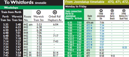
After a “how do you like the timetables?” survey a few months ago, there’s a new look for the recently-changed northern and eastern timetables (like Northern 67) and some of the bus stops in Fremantle. Aside from more sensible folding (yay!) and slightly more colourful maps, the new design drops the quintessential British typeface Gill Sans in favour of the freeway-signage clone Interstate.

I’ve been a little surprised to see this typeface (and cousins like Transit) appear more often in recent years, in places as unusual as corporate reports and fashionable Web-dev pages. And while I am biased against it (alas, I like humanist sans-serifs), I worry that this change makes the big list of numbers less readable than it used to be.
At the least, I suspect they could have taken more care with line spacing and sizes (stop numbers, for instance, could be de-emphasised). Or maybe it’s just me who scrambles to the timetable rack trying to read in the few moments before I miss the bus.
It is, IMHO, a bit like when they dropped the old stripey-T logo a few years back (which is still on one ferry and a few old buses) — the replacement isn’t bad, and it’s modern, but it lacks the elegant practicality of the older style.
(And on that note, WTF Qantas? Maybe your typeface was a bit old-fashioned, but why change a symbol with both history and megabucks of brand-awareness behind it?)


Well noted. Perhaps someone thought that Gill Sans was wasting too much width and a thinner font would be more efficient? It sounds plausible given Transperth’s aesthetics. *sigh*
Maybe so, though I suspect thinness is a bad thing for readability of numbers!
It’s strange that a typeface designed for signs is being used on paper, while (as far as I can tell) Gill Sans is still the go for display signage at the new train stations.
As far as folding goes, I wonder if TP could’ve made it more complicated, given the limitations of using only crosswise, parallel folds all the same distance apart. And if you’ve only got a few minutes, that’s what the screens are for (except that they’ve misaligned the display on the A4-> screen, so I’m standing there wondering why on earth the 78 is stopping at in the A platform, before suddenly realising it’s actually on of my buses and madly dashing down the steps because it’s about to leave.)
And Qantas can get away with it because it’s not really any different – it’s still a white kangaroo on a white background, so the brand-logo recognition is still there, and if they hadn’t had so much fanfare then I suspect more than a few people wouldn’t have noticed. Especially if they’d only put it on the A380s initially – which I read somewhere was one of the reasons for the change, the foot needed to be shifted because of various tail-fin-thingies.
Although I confess I prefer the old kangaroo; the new one looks somehow clumsier, which probably isn’t the impression an airline wants to give *g*
Ah, but the Busport screens aren’t much use to me when only a quarter of the services to Cockburn connect with a bus to my house
Fair enough that the old and new kangaroos aren’t that different, but I think the new one has substantially changed the feel. Normally the feel of a brand is considered its biggest component — but then again, maybe it is just me. British Airways, as an example, has made much bigger changes to their brand in recent years.
I prefer Gill Sans on the timetables over the much thinner Interstate. Interstate doesn’t really read well on the bus stand as seen recently on Cat stops on Phillimore Street, Fremantle. I don’t know but to me it just looks very awkward.